case study
UW Libraries - Scholarly Publishing & Open Scholarship Commons
Project background
The goal of this study was to assess the information architecture of the SPO website and ensure it aligned with user needs, checking if users can easily locate the information they require.
How do users navigate the current SPO website, and where do they encounter difficulties?
What terminology related to research data services and scholarly communications is most familiar and understandable to our target audience (faculty, staff, and graduate students)?
How do we best combine data from this research and user feedback from the Ask Us portal to inform the redesign?
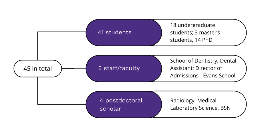
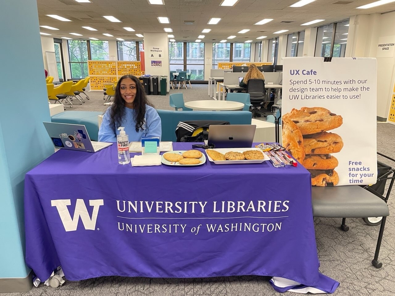
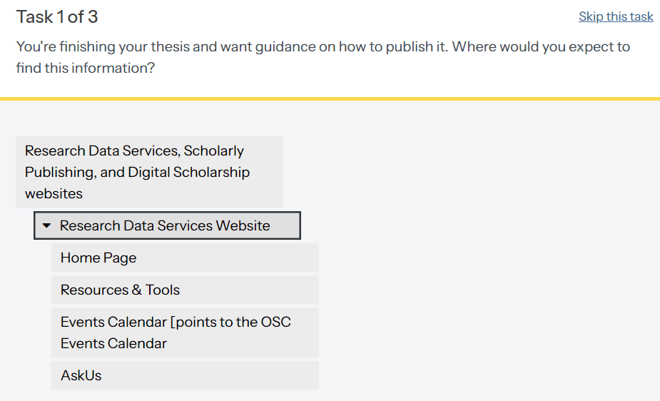
We began by asking participants about their background and needs along with the resources and tools they commonly use in their work or research. Next, we guided them through task-related questions for the tree testing, focusing on how they would navigate the site to find specific information. Finally, we asked follow-up questions to delve into their thought process, uncover any points of confusion, and identify areas where the navigation or terminology was unclear.
What UW library resources or support have you used? What do you usually use them for and how?
You're finishing your thesis and want guidance on how to publish it. Where would you expect to find this information?
Follow-up
Are there any points of confusion? Can you elaborate?
Post-session debriefs allowed us to immediately capture key insights. We conducted thorough synthesis sessions where we triangulated data obtained through the qualitative and quantitative methods and uncovered deeper patterns across participants.
Leveraged metrics from Optimal Workshop (e.g., success rate, directness, and time taken) to measure task efficiency.
Analyzed participant feedback to identify common challenges in navigation, vocabulary confusion, and task completion.
Grouped similar responses to identify key user pain points.
Reviewed data from various sources to understand user mental models and prioritize issues for iteration.
Key Takeaways
Participants encountered several usability challenges on the site, including unclear terminology and complex navigation paths. These issues led to difficulties in task completion and heightened user frustration.
Participants found several terms on the website confusing. Many had never encountered these terms or were unclear about their meanings.
Participants struggled with the site’s structure and navigation. Categories with similar headers caused confusion about where relevant content would be found.
Many participants assumed they could find essential information directly from the homepage but were overwhelmed by the number of steps they had to take to find the information.
Report

Presentation
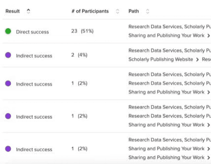
Testing Results
This research has provided us with a deeper understanding of our target users, enabling us to tailor the site more effectively to meet their needs.
Specific usability issues identified during the study were prioritized for immediate action, leading to improved user experience.
The findings directly influenced our upcoming site redesign, guiding decisions on layout, terminology, and navigational structure to enhance usability and increase site engagement.
We gained valuable insights into our target users' behaviors and preferences, allowing us to tailor content and navigation to better meet their needs.
Following the research, our next steps focus on implementing the insights into the upcoming site redesign.
Streamline the information architecture by clarifying categories and pathways, making it easier for users to find relevant content.
Revise labels and descriptions to align more closely with user terminologies and workflows.
Create unique category names that clearly differentiate content and eliminate overlap, particularly between "scholarly publishing" and "digital scholarship."
Continue collecting user feedback through targeted testing sessions with key user groups to gain deeper insights into their mental models, needs, and pain points.
Expand participant recruitment to include graduate students from a broader range of fields, ensuring a more comprehensive understanding of diverse user needs and perspectives.
The next steps include integrating the research insights into the website redesign and conducting targeted user testing to validate the improvements. Follow-up actions will focus on testing the revised visual elements and information architecture to ensure alignment with user expectations.
Though the project successfully yielded valuable insights into student research behaviors and their interactions with the libraries' tools and services, we would have liked to reach a broader audience of users including staff and faculty. Conducting larger, more in-depth interviews with a diverse user group would enhance our findings. Although funding and resources are currently limited, securing the means to incentivize participants for more extensive studies could significantly improve our understanding and uncover key insights that may have been overlooked.
